
Publisher Insight
How to Create Hindi and Punjabi News Graphics with Consistent Branding
A recognizable news graphic needs more than a logo. Script rendering, headline length, photo selection, and spacing all affect whether readers understand it on a phone.
Talk to SaraBiT Media
Discuss your newsroom workflow, search visibility, and publishing requirements with our team.
Quick answer
In brief
Use editable Unicode text, a font that supports the intended script, a restrained set of branded layouts, and short accurate headlines. Preview every Hindi or Punjabi graphic at its intended size, checking line breaks, vowel signs, names, contrast, and the photo crop. Review the exported image as well as the editor preview.
Keep the headline editable until the final review
Begin with the verified article text in the edition’s intended language. Avoid rebuilding a headline from a screenshot or repeatedly copying an already flattened image, because corrections then become harder to make consistently. Keep a clear connection between the article and the words used in the graphic.
Hindi commonly uses Devanagari, while Punjabi editions in India commonly use Gurmukhi. Confirm the script your readership expects rather than treating a language name as a complete typography requirement. Use a native-language editor to review names, spellings, numerals, and meaning before the design is approved.
Check the font in the actual output
Choose a font with the required characters and permission for the intended use. Check combined characters, vowel signs, punctuation, and mixed-language words in the real rendering environment. A typeface that looks suitable in a sample may behave differently when a long place name or a particular character combination appears.
SaraBiT Media supports assigning a font to a language for public news pages. Confirm the available font and rendering controls separately for the banner and reel outputs in your proposed setup. A website font setting should not be assumed to control every generated image or video automatically.
Define a small set of repeatable layouts
Prepare a few useful treatments: a photo-led headline, a text-led update, and an explainer illustration. Give each a consistent place for the logo and headline, with spacing that suits the script. A stable visual system lets editors concentrate on the story while keeping the publication recognizable.
Use the available space to decide headline length. If the wording needs a smaller and smaller font to fit, rewrite the headline while preserving its meaning. Check that no part of a character is clipped and that line breaks keep phrases understandable. A narrow desktop preview is not a substitute for reviewing the finished image on a phone.
Make the photo and headline work together
Choose a verified photo when the graphic represents a real event. Check its source and permitted use, then crop it without removing context needed to understand the scene. Keep important faces, signs, or objects visible and give the headline enough contrast to remain readable.
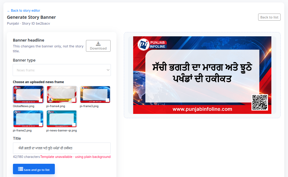
The SaraBiT Media banner editor provides a live preview with photo positioning and headline controls. Its Magic styling feature samples the uploaded photo and offers an adjustable treatment without using an AI model. Review the suggestion and change it when the layout or wording needs a different approach.
Use AI illustrations where readers can understand their role
An original illustration can suit a general explainer or a conceptual story. SaraBiT Media’s separate AI image generator provides that option. It should not be used to fabricate apparent photographic evidence of an event, person, or location that the newsroom has not documented.
Check the generated visual for misleading details and follow the publication’s disclosure rules. Add the final headline with the editing controls so spelling and layout can be reviewed directly. Keep a record of the approved visual and retain source photographs elsewhere when the workflow saves only the finished banner.
Use a final review that matches daily production
Before publishing, compare the graphic with the article: headline meaning, names, locations, dates, numbers, and photo context should agree. Check the logo, contrast, margins, and line breaks in the final image. A second reader is particularly useful when an editor is working outside their strongest language.
If the same story becomes a reel, review the text again in motion. More time on screen may be needed for a longer phrase, and a line break that worked in an image may not suit a vertical slide. Keep corrections coordinated across the article, graphic, and reel instead of assuming that replacing one output replaces them all.
How SaraBiT Media fits
SaraBiT Media combines multilingual publishing with headline-image tools and a News Reel Maker. A demo using your own Hindi or Punjabi headlines can show the available templates and controls and help confirm font, script, and brand requirements before rollout.
Related Publisher Solutions
Move from research into the platform area most relevant to this guide.
More Publisher Guides
Browse related content on CMS selection, launch strategy, audience growth, and publishing operations.
Ready to Launch?
Review your regional-language visual workflow
Bring your logo, a few typical headlines, and sample story photos so we can demonstrate the banner and reel workflow for your publication.